I think you can come up a bunch of nice activities to spend your precious weekend on. Go on a hike, visit an old friend, get a cold drink, sit in the sun, go to the cinema. But what about staying inside and analyzing why stuff happens…no sunlight getting through those curtains.
I was thinking. Sometimes I do that.
Not about something new. Just a very explored topic. Nonetheless my idea is that when people start searching for something on Google, that curiosity doesn’t hit all your channels at the same time. In most cases, web traffic shows up almost immediately. Then online sales follow a week or two later. Store visits and sales agent conversions take a bit longer. Support contacts arrive last. Just assumptions.

But! If that pattern is consistent and measurable, then maybe we can look at Google Trends together with CJA cross-channel data to find early indicators for demand.
This post walks through exactly how to test that hypothesis using CJA data and a local Python analysis. I’m not using external APIs, or dashboards, or data pipelines. Just a CJA export, some public search data, and about 100 lines of code (that claude helped me with #ThankGodforThat).
The analysis question
I wanted to start out in a very structured approach, defining the analysis question that had led me here. So this is just rephrasing what I wrote above.
When public search interest in a product category spikes on Google, how many weeks does it take before we see a measurable response in each of our sales and service channels, and is that lag consistent enough to act on?
This breaks into four sub-questions:
- Is there a statistically significant correlation between Google Trends and each sales channel?
- What is the lag in weeks per channel?
- Is the lag consistent across multiple spikes, not just one event?
- Which channels respond first, and which have the longest tail?
I’m interested in the cross-channel aspect. Not just web data.
So depending on your implementation, you can include the whole customer journey if stitching is enabled in the connection. But you can also do the analysis without. We are just answering a different question.
In this analysis, I’m taking advantage of CJA’s ability to combine datasets based on their person ID. No stitching requirement here. Hopefully that means this post can appeal to a few more people.
Let’s say you have a connection in CJA based on CRM ID. You add datasets to this connection and each dataset will be using their CRM ID presence in each of the datasets as the person ID. That will be linking them together. So adding a web dataset and selecting CRM ID as person ID will lead to analyzing authenticated customer behavior (assuming that this ID will be present when user logs in on the website).
The hypothesis
Search interest leads channel activity, with each channel lagging by a different amount depending on how much friction stands between curiosity and conversion.
This hypothesis comes from a very unstructured research and sunday-brainfog but is also derived from three important layers: awareness signal, conversion and the ability to look across datasets.
1. Awareness (the attention funnel). Classic marketing theory says awareness precedes consideration, which precedes purchase. Each stage takes time. Google searches are an awareness signal. So they measure when people first start thinking about something. The time between that signal and a channel conversion is the lag. I know LLM’s could also be taken into consideration here. But for simplicity, I will solely focus on google. Also for my own sake. Because i’m spending time on this script that I will show in a bit and I want to see daylight this weekend.
2. Conversions (and channel friction). A web session can happen with a single click, while an online purchase may take a few minutes to complete. Then there’s visiting a physical store which requires time and travel. Speaking with a sales agent usually involves scheduling, and a support call often takes place after much of the purchase decision has already been made. Point is, that each channel comes with a different level of effort and friction, so customer intent does not translate into conversions at the same speed. Understanding where that friction exists across the journey is therefore important, as it helps explain both customer behavior and the time it takes for demand signals to appear as measurable outcomes. We could just do the cross-channel analysis in CJA but it’s more fun to include public trend data. It just is.
3. CJA’s Person ID connection. This is the part that makes the analysis across datasets possible in the first place.
So these are the building stones of my analysis.
Why CJA makes this cross-channel analysis possible
A standard analytics setup has separate systems for web, ecommerce, outbound sales, retail, and support. They often don’t share a common key in one connection. You can’t compare them weekly without building a data pipeline. But CJA can handle that.
When you create a CJA Connection with multiple datasets such as web events, sales transactions, call center records, retail touchpoints…CJA merges them into a single logical dataset using Person ID. If your authenticated web users, your CRM, and your retail POS all share a customer identifier, CJA joins them automatically. (Just keep in mind that this connection will provide answers to questions about logged in customers and not anonymous behavior unless you have stitching enabled).
That means one Workspace export gives you a weekly breakdown of sessions, online sales, agent sales, support contacts, store transactions, and retention offers.
Business value
So why even spend time and effort on this? Well…The lag finding is only useful if it changes a decision. But my idea is that you can define a framework for action. I’m all about that. Below are just some examples of actions:
| Channel | Lag | What your response window actually is |
|---|---|---|
| Web sessions | N = 1 | ~7 days lag. To be on top of this, it could make sense to have pre-build SEO content templates so they’re ready to publish immediately. Activate paid search on day 1–2 |
| Online sales | N = 2 | ~14 days lag. Activate paid search later eg. day 4–5. Push email and in-app promos at day 7. SEO content published on day 1 might just get indexed in time |
| Store + Agent | N = 3 | ~21 days lag. Brief teams at week 1 before people show up at the store and calls arrive |
| Support | N = 4 | Update FAQ pages, and brief the support team with talking points before call volume spikes |
| Winback | N = 5+ | Trigger retention campaigns and build audience segments. enough lead time for a proper coordinated effort |
The rule that the analysis reveals: the shorter the lag, the faster your tactics need to be. A 1-week window rules out anything that takes time to set up like new content, physical prep, campaign briefs.
Maybe this could become a scalable solution? But that’s another weekend.
Anyway, I think we should get to the actual setup.
Setting up the project
These are the steps I went through. I used the terminal in Visual Studio Code. Everything runs locally.
Prerequisites
You need Python 3.8+ and a terminal. Check with:
python3 --version
Create the project folder
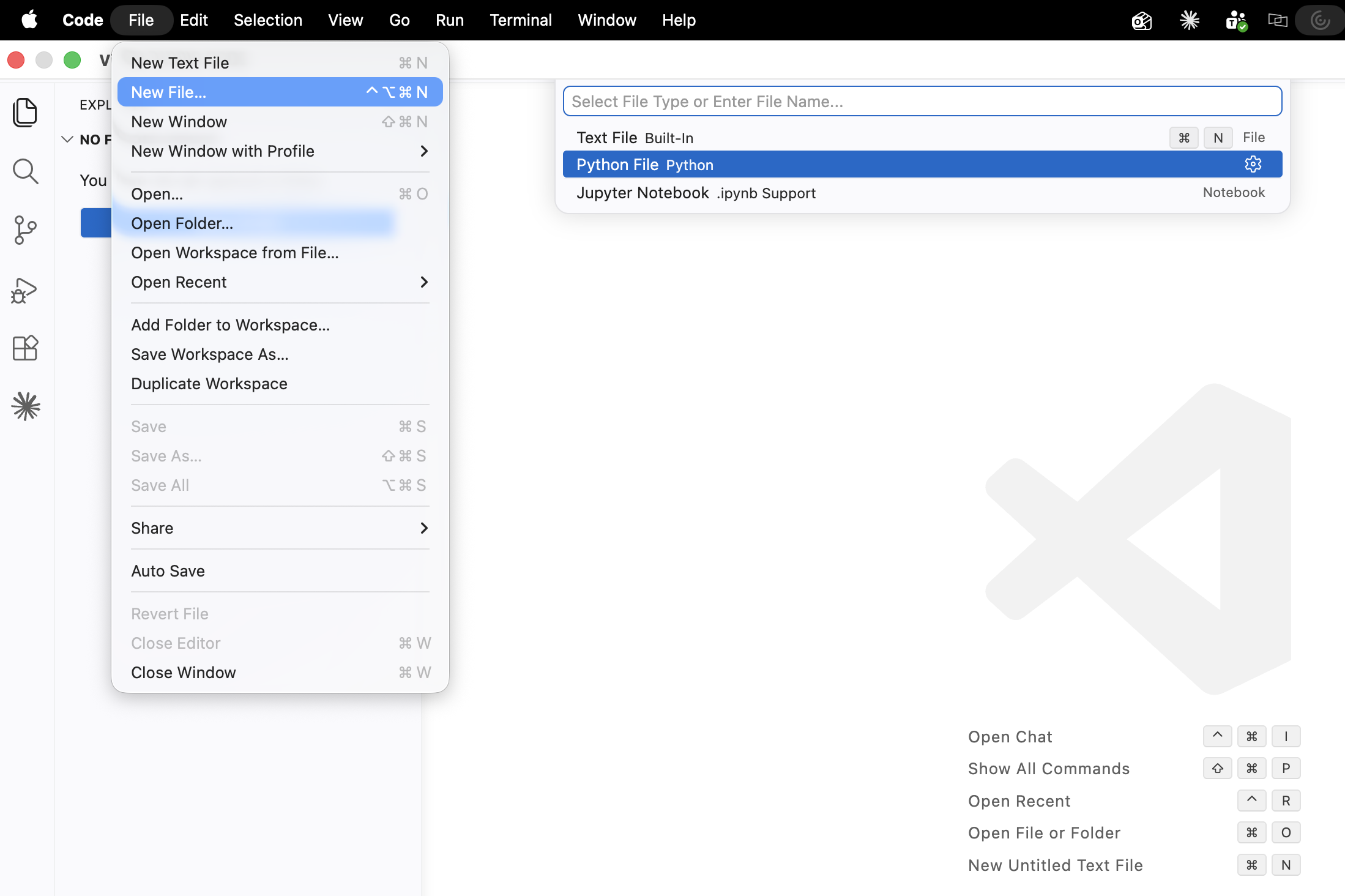
Open VS Code. Then create a new python file for your analysis. Then save it in a new directory / folder that you can easily locate:
Set up a virtual environment
Then open the integrated terminal (Ctrl / command +`j):
python3 -m venv .venv
source .venv/bin/activate
Install dependencies
pip install pandas numpy matplotlib scipy
Create a requirements.txt in VS Code with:
pandas
numpy
matplotlib
scipy
Initialise git (if you’d like to store this in your GitHub)
git init
git config user.email "your@email.com"
git config user.name "Your Name"
Create a .gitignore file in VS Code (new file → name it .gitignore):
data/
plots/
.venv/
__pycache__/
*.pyc
.DS_Store
Getting the data
Google Trends: Yes I did Manual export
Honestly, I did not smoothly “pip install” something and move on. I spent an embarrassing amount of time trying to automate the Google Trends extraction before giving up and just downloading the CSV like a normal person.
The obvious starting point was pytrends, a Python library that wraps Google Trends. Except it turned out the library was archived in April 2025. Google moved their endpoints and the maintainers stopped updating it. Every request came back with a 400 error.
pytrends.exceptions.ResponseError: The request failed: Google returned a response with code 400
Fine. I tried adding retries and other stuff. Still got error 400. Tried a newer alternative called trendspyg. That one installed fine, but the moment I called it:
trendspyg.exceptions.RateLimitError: Google Trends did not return Explore data
(persistent rate-limit / 'try again in a bit')
And I had to wait. Actually wait. Before I could try again.
By that point I could see the sun going down outside. So I just went to trends.google.com, searched my keywords, clicked the download icon, and had the data in about two minutes. Sometimes the pragmatic solution is the one you should have started with.
For what it’s worth, if Google ever fixes their API situation, the extract_trends.py script already reads the CSV in the exact same format the download produces. You could swap in an automated extraction later without touching anything else.
Go to trends.google.com. Search your keywords. In this example, I searched for: iphone, internet, 5g, abonnement. Set:
- Country: Denmark (or your market)
- Time range: Last 18 months
- All four keywords in the same search (so they’re normalised against each other)
Download the CSV using the download icon on the Interest over time chart. Save it to the subfolder data/.
I chose a long date range and ended up splitting the export by downloading smaller ranges and saved them separately. The script below handles merging.
CJA export: also manual
In CJA Workspace, build a Freeform table:
- Row dimension: Week
- Columns: Sessions (web), and then one Sales metric column per channel. I used a demo data set with the following channels: Online, Agent, Call Center, Store, Winback/Retention.
- Date range: Last 18 months
Download as CSV. Save as .csv. Make sure the files are in the correct folder.
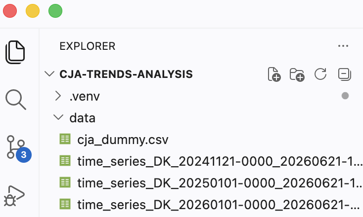
The scripts
Now we get to the fun part. Let’s create two scripts in VS Code as new files in the project root.
First script: extract_trends.py -> load and merge Trends data
This first script reads your downloaded Trends CSVs, handles mixed daily/weekly granularity across multiple files, and outputs one clean weekly file + handles the split date range files I downloaded.
import pandas as pd
import glob

# Load all Google Trends CSV files from data/
files = sorted(glob.glob("data/time_series_DK_*.csv"))

# This is just good to have
if not files:
    raise FileNotFoundError("No trend files found in data/. Copy your CSV files there first.")

print(f"Found {len(files)} file(s):")
for f in files:
    print(f"  {f}")

# This is important
dfs = []
for f in files:
    df = pd.read_csv(f)
    # Strip quotes from column names and values
    df.columns = [c.strip('"') for c in df.columns]
    df["Time"] = pd.to_datetime(df["Time"].str.strip('"'))
    df = df.set_index("Time")
    # Convert all columns to numeric (handles any stray strings)
    df = df.apply(pd.to_numeric, errors="coerce")
    dfs.append(df)

# Combine all files
combined = pd.concat(dfs)

# Resample to weekly handles daily data by averaging, aligns with CJA week start
weekly = combined.resample("W-MON").mean().round(1)

# Remove duplicate weeks from overlapping date ranges. I realised I needed this in my first attempt
weekly = weekly[~weekly.index.duplicated(keep="first")]
weekly = weekly.sort_index().dropna(how="all")

weekly.to_csv("data/trends_raw.csv")

print("\n--- Preview ---")
print(weekly.head(10))
print(f"\nRows: {len(weekly)} weeks of data")
print(f"Columns: {list(weekly.columns)}")
print(f"Date range: {weekly.index[0].date()} → {weekly.index[-1].date()}")
print("\nSaved to data/trends_raw.csv")
Run it:
python extract_trends.py
analysis.py: cross-correlation and plots
This is the main script. It loads both datasets, runs a cross-correlation for every keyword × channel pair across lags of -4 to +8 weeks, and produces three types of visualisation. Why is -4 part of this? So I actually want the negative values to included here to see if a channel might actually drive demand before google trends shows anything. Then I also asked Claude to make sure the script is written to work with any keywords and any channel names. So nothing is hardcoded.
import pandas as pd
import numpy as np
import matplotlib.pyplot as plt
from matplotlib.patches import Patch
from scipy import stats
import os

# 1. LOAD GOOGLE TRENDS DATA
trends = pd.read_csv("data/trends_raw.csv", index_col="Time", parse_dates=True)
print(f"Trends data: {len(trends)} weeks | {trends.index[0].date()} → {trends.index[-1].date()}")
print(f"Keywords: {list(trends.columns)}\n")

# 2. LOAD CJA DATA
# Export a weekly Freeform table from CJA Workspace with one column
# per channel. Save as data/cja_export.csv and update the filename below.
CJA_FILE = "data/cja_export.csv"

cja = pd.read_csv(CJA_FILE, index_col="week", parse_dates=True)

# Treat zero-sales weeks as missing (data ramp-up period)
sales_cols = [c for c in cja.columns if c != "web_sessions"]
cja[sales_cols] = cja[sales_cols].replace(0, np.nan)

print(f"CJA data loaded: {len(cja)} weeks | Channels: {list(cja.columns)}\n")

# 3. CROSS-CORRELATION ANALYSIS
# For each keyword × channel pair:
# shift Trends by lag weeks, compute Pearson r, find the peak lag
# Positive lag = Trends leads CJA (Trends spike happened N weeks before channel response)
# Negative lag = channel moved first (worth investigating why)

LAG_RANGE = range(-4, 9)
results = []

for kw in trends.columns:
    for ch in cja.columns:
        correlations = {}
        for lag in LAG_RANGE:
            trend_shifted = trends[kw].shift(lag)
            merged = pd.DataFrame({"trend": trend_shifted, "cja": cja[ch]}).dropna()
            if len(merged) < 10:
                continue
            r, p = stats.pearsonr(merged["trend"], merged["cja"])
            correlations[lag] = (r, p)

        if not correlations:
            continue

        best_lag = max(correlations, key=lambda l: correlations[l][0])
        best_r, best_p = correlations[best_lag]

        results.append({
            "keyword":  kw,
            "channel":  ch,
            "best_lag": best_lag,
            "r":        round(best_r, 3),
            "p_value":  round(best_p, 4),
            "signal":   "strong" if abs(best_r) > 0.6 else "moderate" if abs(best_r) > 0.4 else "weak",
            "all_lags": correlations
        })

results_df = pd.DataFrame(results)[["keyword","channel","best_lag","r","signal","p_value"]]
results_df = results_df.sort_values("r", ascending=False)

print("═" * 65)
print("CROSS-CORRELATION RESULTS")
print("═" * 65)
print(results_df.to_string(index=False))
print()

# 4. PLOT 1: TIME SERIES OVERLAY
os.makedirs("plots", exist_ok=True)

fig, axes = plt.subplots(len(cja.columns), 1, figsize=(14, 3 * len(cja.columns)), sharex=True)
fig.suptitle("Google Trends vs CJA Channels (normalised)", fontsize=14, fontweight="bold", y=1.01)

kw_colors = ["#FF6B35", "#9C27B0", "#4CAF50", "#FF9800"]

for ax, ch in zip(axes, cja.columns):
    ch_norm = (cja[ch] - cja[ch].min()) / (cja[ch].max() - cja[ch].min())
    for kw, kw_color in zip(trends.columns, kw_colors):
        kw_norm = (trends[kw] - trends[kw].min()) / (trends[kw].max() - trends[kw].min())
        ax.plot(trends.index, kw_norm, color=kw_color, linewidth=1.2,
                linestyle="--", label=f"{kw} (Trends)", alpha=0.7)
    ax.plot(cja.index, ch_norm, color="#2196F3", linewidth=2, label=ch)
    ax.set_ylabel("Normalised", fontsize=9)
    ax.set_title(ch, fontsize=10, fontweight="bold")
    ax.legend(fontsize=7, loc="upper left")
    ax.grid(axis="y", alpha=0.3)

plt.tight_layout()
plt.savefig("plots/timeseries_overlay.png", dpi=150, bbox_inches="tight")
plt.close()
print("Saved: plots/timeseries_overlay.png")

# 5. PLOT 2: CORRELOGRAM PER KEYWORD
# One plot per keyword, one panel per CJA channel
# Red bar = best lag, blue = all other lags

for keyword in trends.columns:
    channel_results = {r["channel"]: r for r in results if r["keyword"] == keyword}

    fig, axes = plt.subplots(1, len(cja.columns), figsize=(16, 4), sharey=True)
    fig.suptitle(f"Lag Correlogram: '{keyword}' Trends → CJA Channels", fontsize=13, fontweight="bold")

    for ax, ch in zip(axes, cja.columns):
        res = channel_results.get(ch, {})
        lags = list(LAG_RANGE)
        rs = [res["all_lags"].get(l, (0, 1))[0] for l in lags]
        best = res.get("best_lag", 0)

        bar_colors = ["#E53935" if l == best else "#90CAF9" for l in lags]
        ax.bar(lags, rs, color=bar_colors, edgecolor="white", linewidth=0.5)
        ax.axhline(0, color="black", linewidth=0.5)
        ax.axvline(best, color="#E53935", linewidth=1, linestyle="--", alpha=0.5)
        ax.set_title(ch, fontsize=9, fontweight="bold")
        ax.set_xlabel("Lag (weeks)", fontsize=8)
        ax.set_xticks(lags)
        ax.set_xticklabels(lags, fontsize=7)
        if rs and max(rs) > 0:
            ax.text(best, max(rs) * 0.9, f"r={res.get('r', 0):.2f}\nlag={best}w",
                    ha="center", va="top", fontsize=8, color="#E53935", fontweight="bold")

    axes[0].set_ylabel("Pearson r", fontsize=9)
    plt.tight_layout()
    plt.savefig(f"plots/correlogram_{keyword}.png", dpi=150, bbox_inches="tight")
    plt.close()
    print(f"Saved: plots/correlogram_{keyword}.png")

# 6. PLOT 3: CHANNEL LAG RANKING PER KEYWORD
# The key business output: which channel reacts first to a Trends spike

signal_colors = {"strong": "#2E7D32", "moderate": "#F57F17", "weak": "#B0BEC5"}

for keyword in trends.columns:
    kw_results = results_df[results_df["keyword"] == keyword].copy()
    kw_results = kw_results.sort_values("best_lag")

    bar_colors = [signal_colors[s] for s in kw_results["signal"]]

    fig, ax = plt.subplots(figsize=(10, 5))
    bars = ax.barh(kw_results["channel"], kw_results["best_lag"],
                   color=bar_colors, edgecolor="white", height=0.6)

    for bar, (_, row) in zip(bars, kw_results.iterrows()):
        ax.text(bar.get_width() + 0.05, bar.get_y() + bar.get_height() / 2,
                f"r={row['r']:.2f} ({row['signal']})", va="center", fontsize=9)

    ax.set_xlabel("Lag in weeks (positive = Trends leads CJA)", fontsize=10)
    ax.set_title(f"How many weeks does '{keyword}' Trends lead each CJA channel?",
                 fontsize=12, fontweight="bold")
    ax.axvline(0, color="black", linewidth=0.8)
    ax.set_xlim(-5, 11)
    ax.grid(axis="x", alpha=0.3)

    legend_elements = [Patch(facecolor=c, label=s.capitalize()) for s, c in signal_colors.items()]
    ax.legend(handles=legend_elements, title="Signal strength", loc="lower right", fontsize=9)

    plt.tight_layout()
    plt.savefig(f"plots/channel_lag_ranking_{keyword}.png", dpi=150, bbox_inches="tight")
    plt.close()
    print(f"Saved: plots/channel_lag_ranking_{keyword}.png")

print("\n✓ Analysis complete. Open the plots/ folder to view results.")
Run it:
python analysis.py
How to interpret the analysis
Before looking at outputs, it helps to know what the numbers actually mean. I wanted a structured, statistical approach. Classic.
Cross-correlation: what it is
So a standard correlation asks: do two things move together? but in this analysis we are actually doing Cross-correlation. This type of analysis asks the same question but shifts one series in time before comparing. We shift the Google Trends signal forward by N weeks and then measure whether it matches the CJA channel data to answer our analysis question. We repeat this for every lag value from -4 to +8 weeks and record the result each time.
The lag where the match is strongest is the lead time, how many weeks in advance the Trends signal predicts that channel.
Pearson r: the correlation coefficient
Now time for some fundamentals. Pearson r measures the strength of a linear relationship between two series. It runs from -1 to +1:
It’s a well known method of understanding if a relationship is meaningful.
- r = 1.0 : perfect positive relationship. When Trends goes up, the channel goes up by the same proportion, every time.
- r = 0.0 : no linear relationship. The two series move independently.
- r = -1.0 : perfect negative relationship. When Trends goes up, the channel goes down.
In practice you’d probably never see 1.0 or -1.0 in real data. For this type of weekly time series analysis, I have based a rough guide on standards in marketing and behavioral data:
| r value | Signal label | Practical meaning |
|---|---|---|
| > 0.6 | Strong | Clear, consistent relationship (usable for planning) |
| 0.4 – 0.6 | Moderate | Real signal but noisy (directionally useful) |
| 0.2 – 0.4 | Weak | Faint pattern (interesting to note, don’t act on alone) |
| < 0.2 | None | Too weak to rely on |
The p-value: statistical significance
Every correlation also has a p-value. This answers a different question than r, and the distinction matters a lot:
- Pearson r asks: how strong is the relationship? (the size of the pattern)
- The p-value asks: can I trust that the relationship is real? (the odds it isn’t just luck)
So r is strength, p is trust. A p-value below 0.05 means there’s less than a 5% probability the result appeared by random chance. So a low value indicates a real relationship.
The reason we need both is that they can disagree.
| What you see | r | p | Verdict |
|---|---|---|---|
| Strong and trustworthy | 0.80 | 0.001 | Real and meaningful |
| Strong but untrustworthy | 0.80 | 0.30 | probably a coincidence (usually too little data) |
| Weak but trustworthy | 0.25 | 0.01 | A real relationship, but too faint to be useful |
| Weak and untrustworthy | 0.15 | 0.60 | I’d just ignore this tbh |
The dangerous row is the second one: a big, exciting r that’s actually meaningless because there wasn’t enough data behind it. A high r on its own is not a finding. You only act on a pairing when both numbers look good: a strong r and a low p. Reminds me of an A/B tests that I once ran. The traffic / data was very low. But it provided some “nice results” on the test experience.
The correlogram: reading the chart
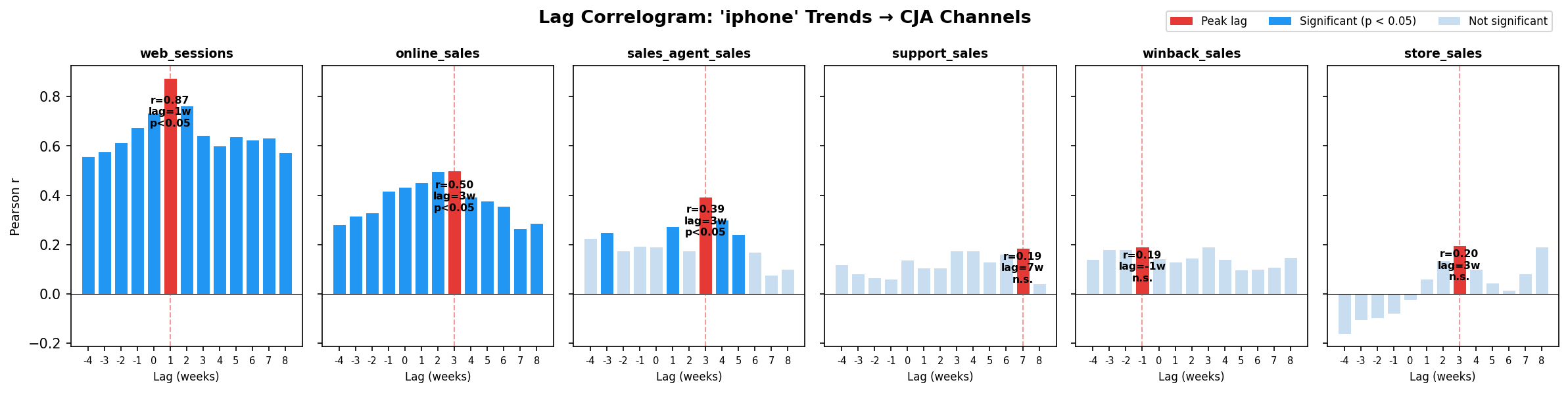
If you scroll further down, you’ll see a correlogram that plots r on the Y axis and lag (weeks) on the X axis. Each bar is one lag value. The red bar is the peak.
The script gives you one chart per keyword, and from it you read two things. First, how tall the peak is. That’s the strength (r), which is what the height of every bar shows. Second, how sharp the peak is. That’s just you looking at the shape to judge whether the lag is pinned to one specific week or smeared across several. This part is a judgment call you make by looking, not a statistic the script calculates for you.
The p-value (the “can I trust this” number from earlier) is also visible. Furthermore, a solid blue bar is statistically significant (p < 0.05). A faded bar is not. The red peak bar also gets a small label telling you whether it met the p < 0.05 requirement or not (shown as “n.s.” for not significant). So the colour carries the significance, and the height carries the strength. The full p-values for every pairing are also printed in the terminal table when you run the script.
So here’s my interpretation:
- Sharp single peak: the lead time is precise. The channel follows Trends at one identifiable lag, and I can trust the specific number of weeks. High confidence if it meets p < 0.05.
- Broad plateau: there’s a relationship, but it’s spread across several weeks.
- Flat across all lags: no relationship at any lag. This keyword doesn’t predict this channel.
- Peak at a negative lag: the CJA channel is moving before the Trends signal. The channel is a leading indicator, not a lagging one.
What this analysis does not prove
I think it is always important to keep in mind that any correlation analysis finds patterns. It does not establish causation. A strong r between iPhone searches and web sessions means they move together. It doesn’t prove that one causes the other. Both could be driven by a third thing (a product launch, a news event, a competitor campaign).But that is just a question of what considerations and nuances we include in our methodological approach.
Nonetheless, the analysis is most useful when the pattern is consistent across multiple spikes over the 18-month window, and when the lag makes intuitive sense given what we know about customer behaviour in that channel. From my perspective, this should not be an isolated analysis.
What the results look like
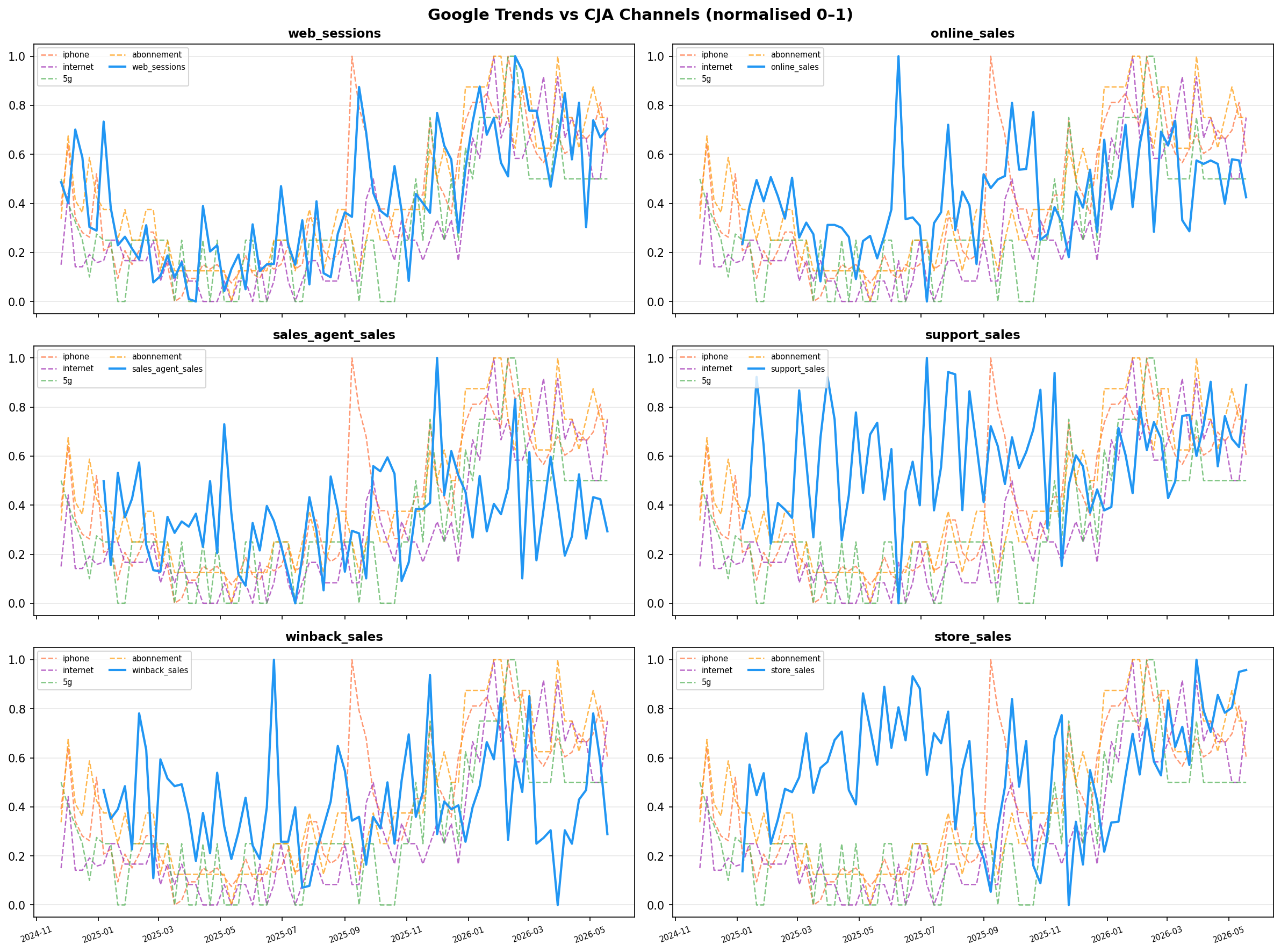
I work best with visuals to be honest. So the time series overlay is the sanity check for me. With the trended visualisation below, I can see if the Trends lines and channel volumes actually move together. If there’s no visible pattern here, the correlation numbers won’t mean much to me.
The correlogram shows the Pearson r at each lag value for a given keyword. The red bar is the peak, that’s our lead time. A sharp, isolated red bar means the signal is reliable. A flat chart across all lags means the keyword simply doesn’t predict that channel.
The channel lag ranking is the business output. One bar per channel, length = weeks of lead time, colour = signal strength.
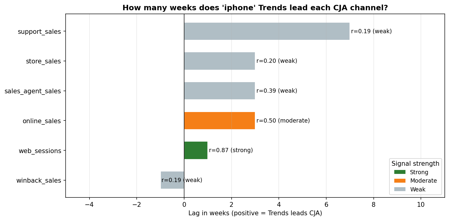
Here’s what the iphone keyword actually showed with dummy data. Note that a lag value is only meaningful when the correlation is strong enough to act on, a lag of 7 weeks with r = 0.19 is not a finding, it’s noise with a number attached to it.
| Channel | Lag | Correlation | p-value | Usable? |
|---|---|---|---|---|
| Web sessions | 1 week | r = 0.87 strong | < 0.001 | ✓ Yes. consistent signal |
| Online sales | 3 weeks | r = 0.50 moderate | < 0.001 | ✓ Directionally useful maybe, but noisy |
| Sales agent | 3 weeks | r = 0.39 weak | 0.001 | △ Faint signal: worth monitoring, not planning around |
| Store | 3 weeks | r = 0.20 weak | 0.10 | ✗ No: physical visits don’t follow search interest in this data |
| Support | 7 weeks | r = 0.19 weak | 0.12 | ✗ No: not driven by iPhone searches |
| Winback | no reliable lag | r = 0.19 weak | 0.11 | ✗ No: campaign calendar, not search-driven |
See how the three “no” rows all have p-values above 0.05? That’s the significance test agreeing with the eye test. Those aren’t just weak correlations, they’re not statistically distinguishable from random noise. The p-value and the r are telling the same story here, which is exactly what you want before trusting a result.
The support channel is the most interesting finding. iphone barely predicts it. But switch the keyword to internet:
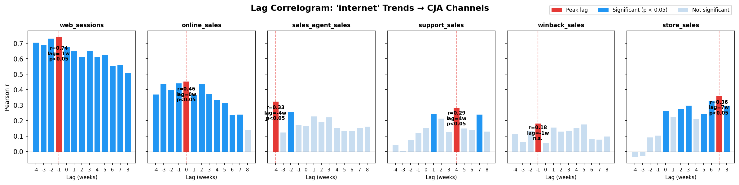
Support correlates more with internet searches (r = 0.29 at lag 4) than with iphone. Which makes sense in my head. People call support because they’re having connectivity issues, not because they just bought a phone.
This is the kind of thing the analysis is for: finding which keyword actually predicts which channel and which channels are driven by something else entirely.
Swapping in real CJA data
When you have a real CJA export, the only change is one line in analysis.py:
CJA_FILE = "data/cja_export.csv" # was: data/cja_dummy.csv
Your column names will differ. Update them to match your export headers. The analysis logic stays identical.
Real data will problably be much noisier. Some pairings that look strong with dummy data will be weaker. Some lags might even surprise. But that’s the point about this analysis. Because the finding is in the deviation from expectation, not confirmation of it.
The CJA angle worth highlighting
What this project demonstrates is that cross-channel CJA data isn’t only useful for journey analysis and attribution within Workspace. It can serve as the input to any time-series comparison, demand forecasting, channel lag modelling, seasonality decomposition, anomaly detection.
The data is already connected. The question is what you do with it.
The idea with this small project is to have test and build a methodological approach to correlation analysis using google trends data and cross-channel data.
Notes: All code runs locally. You need Python 3.8+, a CJA Workspace export, and a Google Trends CSV download.*
References + further reading
- Cohen, J. (1988). Statistical Power Analysis for the Behavioral Sciences (2nd ed.). I had to revisit a lot of this. It’s been a while.
- What is with all these different correlation thresholds? (RTI International).
Join the discussion
Leave a comment