I like the idea of the Pareto Principle and its simplicity.
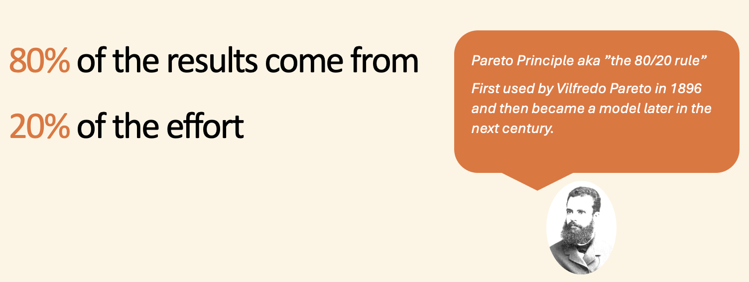
The thought that a relatively small number of things often drive the majority of outcomes.
- 20% of products driving 80% of revenue
- 20% of customers driving 80% of value
- A handful of pages driving most engagement
It is one of those concepts that sounds almost a lil too simple 👀, but somehow keeps appearing everywhere in analytics. So of course I wanted to try this out properly in Adobe Analytics.
I wanted to actually identify which products were driving most of the revenue and then use that knowledge operationally inside Adobe Analytics.
This ended up being a small reminder that analysis sometimes takes a brief detour outside Adobe Analytics before finding its way back.
Step 1: The Basics
I wanted to make this as simple as possible. So I started with a table. As you do.
I created a Freeform Table in Adobe Analytics with:
Product IDOnline Revenue
Then I sorted the table descending by revenue.
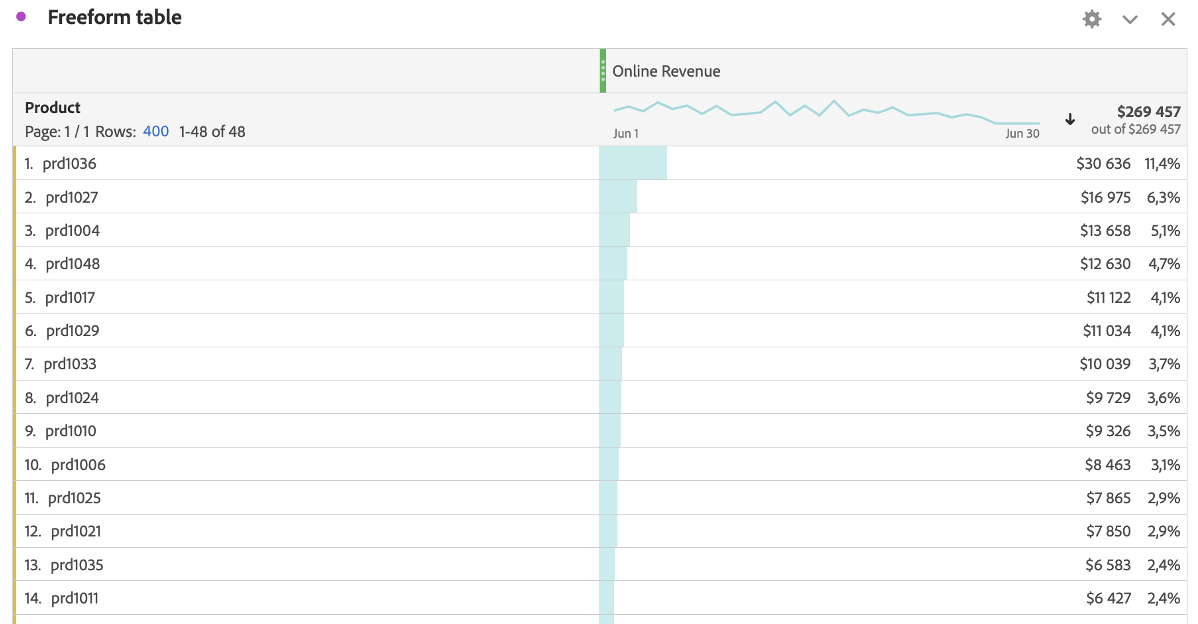
Now I had the foundation.
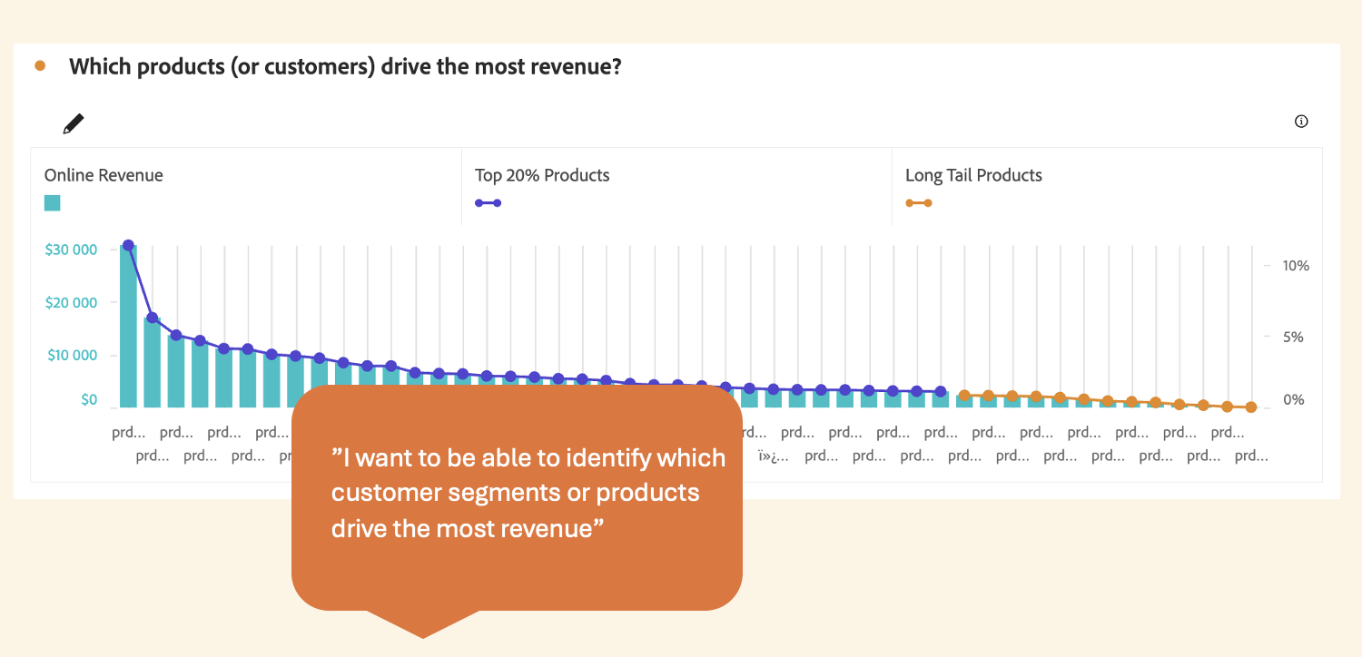
Next I really wanted to create the classic Pareto chart:
- Bars = revenue per product
- Line = cumulative % of total revenue
- Identify where cumulative revenue hits 80%
The cumulative percentage is the core part of the Pareto analysis because it shows how revenue accumulates across products when they are sorted from highest to lowest contribution. Without the cumulative view, you only see isolated product performance.
With cumulative percentage, you start seeing the distribution of value across the business. So that part is pretty important.
And all of this which would be fairly simple to create. At least in my head and in theory. But now I started to meet some limitations within the analysis workspace.
Step 2: The First Confusing Part
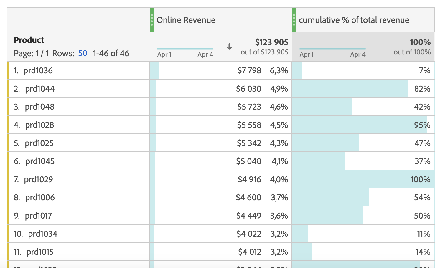
I started creating a revenue metric with the cumulative function inside Workspace. At first glance it looked correct. Like a table with numbers.
Then suddenly I noticed things that made absolutely no sense.
My first thought was:
“Why does the cumulative percentages look kinda random?”
And I realized using cumulative function and sorting revenue by products in the table does not actually apply the cumulative behavior the way I expected. It’s still tied to time-based dimensions. While I expected the percentages in the rows to increase - starting from 7% and accumulating the percentage of the total revenue onto each row (each product).
Imagine you’re ranking your grocery items by price… like most expensive at the top and you want a running total column that shows “how much of my total grocery bill is accounted for so far.”
This would require the list of groceries to be sorted so the most expensive item is first. But the cash register calculated the running total in the order they scanned things at checkout, which was completely random. Maybe something like that was happening here.
So what you really wanted was something like this:
| Item | Price | Running total % |
|---|---|---|
| Steak | €25 | 8% |
| Salmon | €18 | 15% |
| … | … | … |
| Chewing gum | €0.50 | 100% |
Chewing gum shows 100%. not because it’s the most expensive, but because it happened to be the last thing you scanned. That’s when the running total hit 100%.
Not shaming cumulative functions. They work perfectly over time-based dimensions (like Day, Week, Month), because the data has a natural sequential order. But for non-time dimensions, like Product, AA or CJA doesn’t handle those values in the way that I want it to.
That was the moment I realized..
I probably needed Excel.
Step 3: Exporting the Data
So I exported the table from Adobe Analytics into Excel.
Just:
Product IDRevenue
Yeah, that’s all.
(You could also use report builder. Do whatever. Just get the data)
Step 4: Formatting in Excel
I did some formatting to prepare the table.
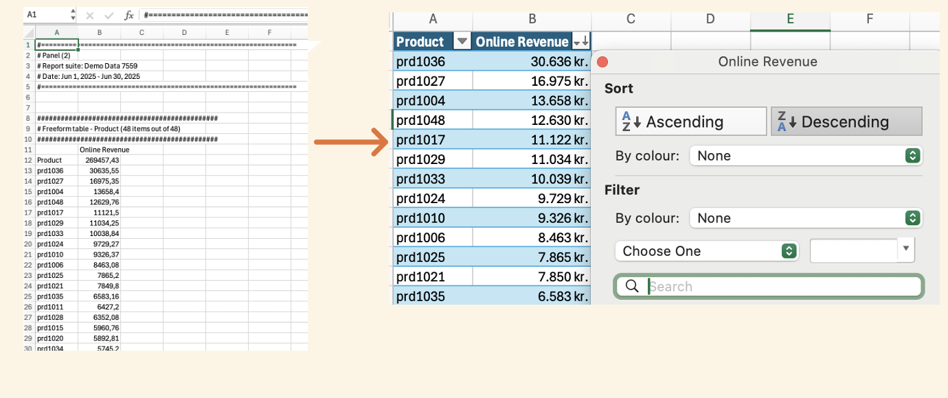
Then I sorted products to be descending by revenue.
Now the next step was just adding the two calculated columns.
Step 5: Percentage of Total Revenue
=Revenue / Total Revenue
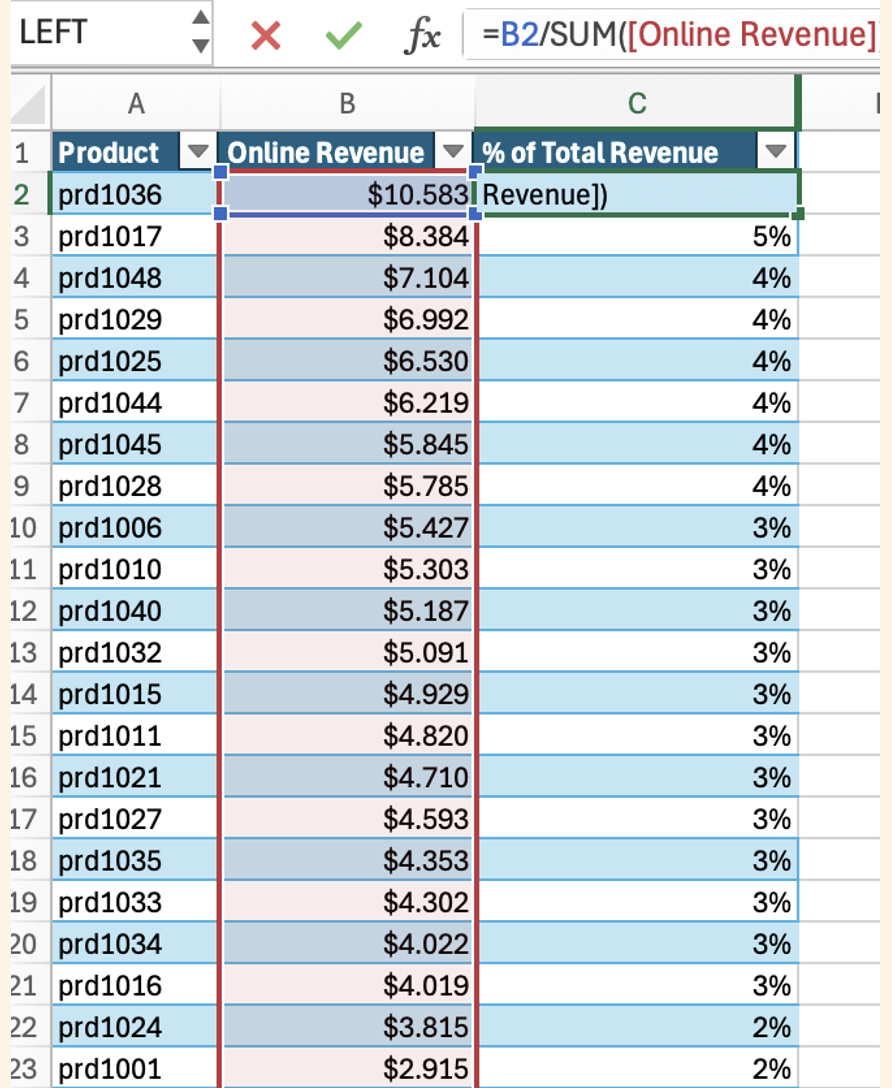
This showed how much each individual product contributed to overall revenue.
Step 6: Cumulative Percentage of Total Revenue
=SUM($C$2:C2)
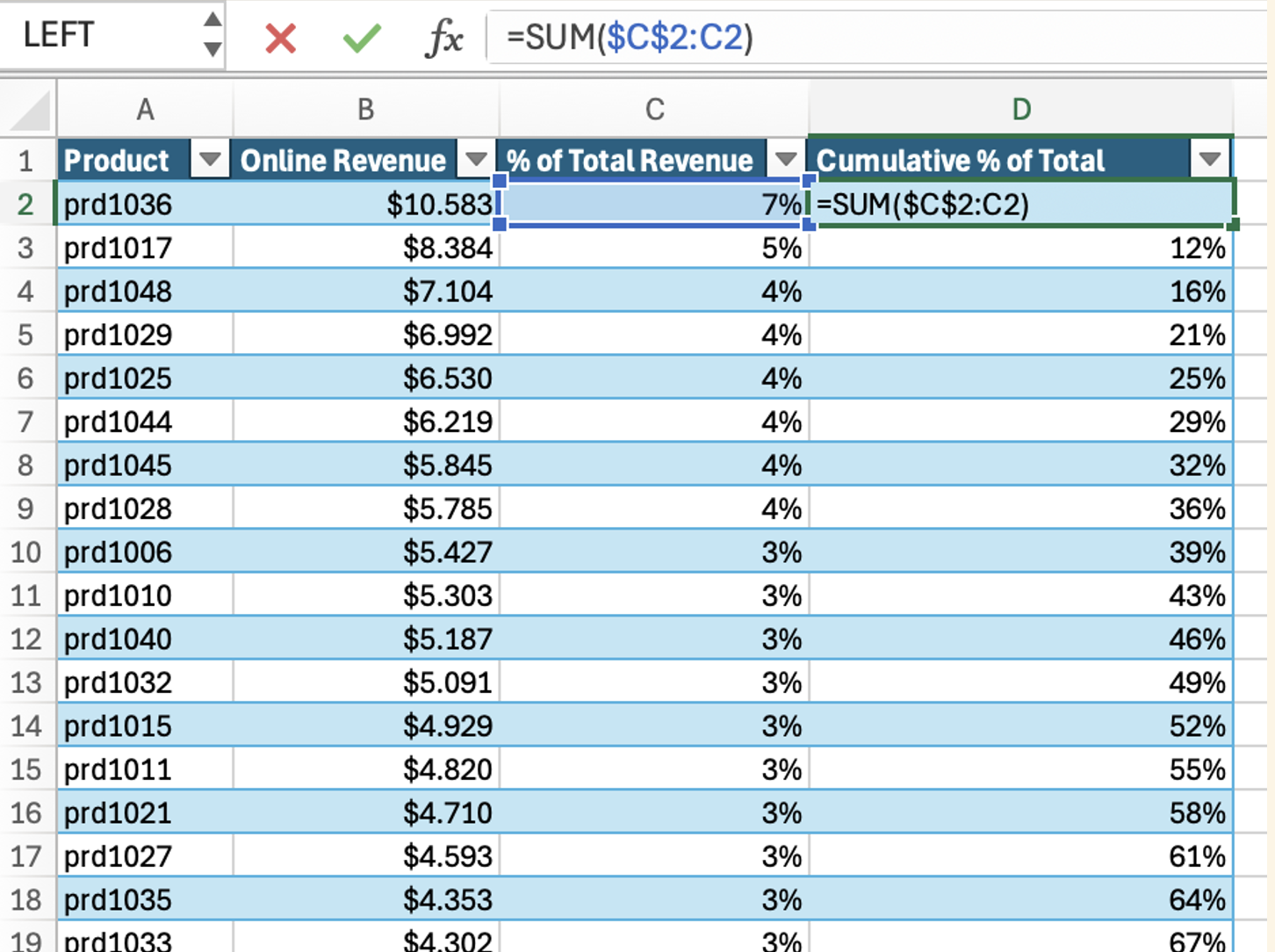
Now the cumulative logic became completely transparent. This one tells us how much of the total revenue has been accumulated up to and including this row in the table.
The percentage starts low and gradually climbs toward 100%.
To me, that is how a Pareto curve should behave.
Step 7: Product Grouping Logic
Then came the important part. We can now apply the principle.
I created a formula that classified products based on whether they belonged to the group contributing to the first 80% of total revenue. In practice, this meant identifying the point where the cumulative percentage of revenue reached ≥80% (less than or equal to).
The products included up until that threshold represented the small subset of products driving the majority of revenue. Essentially the classic Pareto principle, where roughly 20% of products contribute to 80% of revenue.
=IF(D2<=0,8; "Top 20% Products"; "Long Tail")
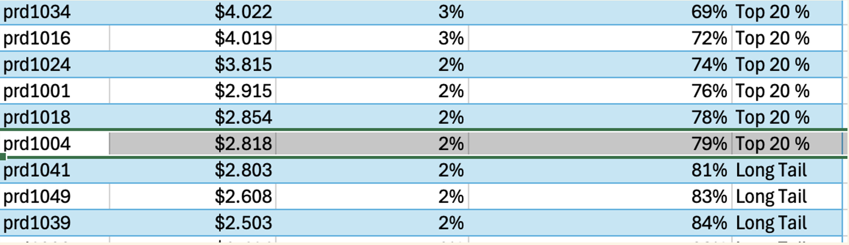
This separated the dataset into two groups:
- Top Products
- Long Tail Products
We could stay here in excel. That is possible. But does anyone really want to do that?
Step 8: The Visualization
Getting back home is nice. I am not going to compete at The Microsoft Excel World Championship. So why spend more time in Excel. But you can sign up here if that is what you truly want.
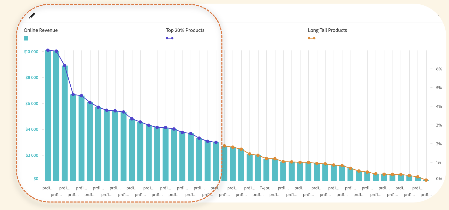
Things can look nice in AA and CJA. So once the excel-formulas were in place, I could go into the analytics tools again and create a combo chart.
- Bars = revenue per product
- Line = cumulative percentage
- Horizontal reference line = 80%
This would allow me to see the distribution.
- where the “vital few” products ended
- where the long tail began
But… wait. How do we actually get those calculations back into AA? Didn’t I just storm out of Workspace the moment I realized it couldn’t give me what I needed? That maybe I just wanted someone who would finally listen to me and understand my cumulative percentage problems? 🙄 🎀
So maybe this wasn’t an actionable real ‘step 8’..
Step 8 (for real): Bringing It Back into Adobe Analytics
Now we’re here. Where the exercise becomes useful.
I’ll try to stay simple. I knew which products belonged to the “Top 20%” group. So I could operationalize it inside Adobe Analytics. I knew the revenue threshold at which the products reached the 80% mark.
I created two calculated metrics.
Top 20% Products: If the product revenue is greater than or equal to the revenue at the 80% mark, then it can be categorized as Top 20 % Products
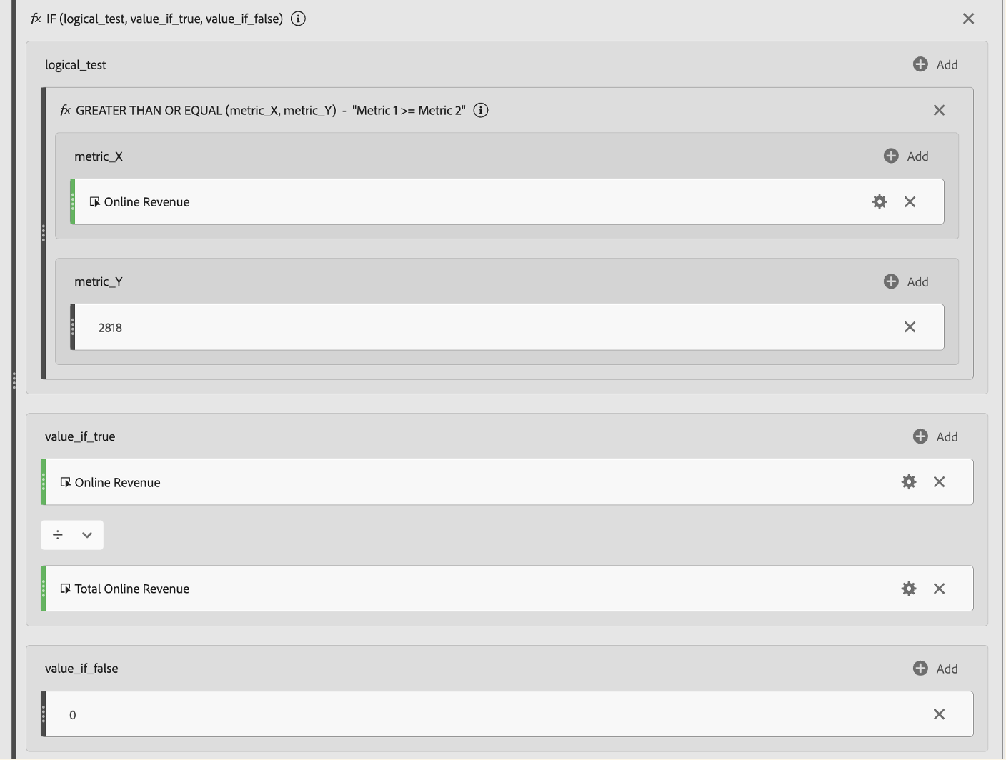
Long Tail Products: This is just the opposite logic. If the product revenue is less than the revenue at the 80% mark, then it can be categorized as Long Tail Products.
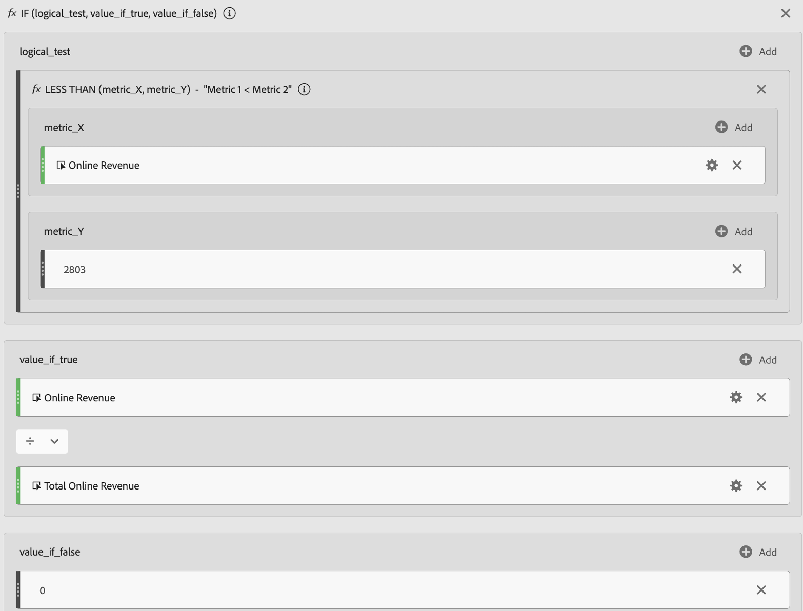
With these calculated metrics, I could finally create the bar graph vizualisation (combo).
And now I had the foundation needed to explore the nuanced differences between the high-value products and the long tail. Such as:
- traffic sources
- entry pages
- device behavior
- customer journeys
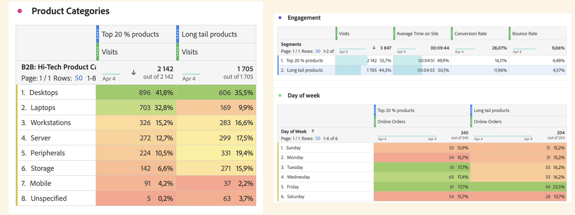
And this is where the real analysis starts.
The Interesting Part About the Long Tail
The long tail is often where things become more interesting than expected.
Maybe the top products dominate revenue because they already have strong visibility.
But:
- what products drive engagement?
- what products introduce users to the brand?
- what products overperform in organic search?
- what products are frequently viewed but rarely promoted?
Sometimes the “low revenue products” are strategically more important than their direct revenue suggests.
And Pareto analysis becomes less about:
“What sells the most?”
and more about:
“How is value distributed across the business?”
My Main Takeaway
I initially thought this would be a pure Analytics exercise.
Instead, it became a good reminder that analysis work can sometimes live between tools.
That’s alright. I got the analysis to work. The main thing to keep in mind with this approach is that it gives you a snapshot of the real world at a specific point in time. This is not really meant for a dashboard. This is an analyst setting up for a one-time analysis. The data does not automatically update, although you could probably build a setup that does.
Join the discussion
Leave a comment