High clicks. Low bounce rate. Must be working.
I’ve sat in many meetings talking about how awesome it is to see the number of clicks go up. And I get it. Those numbers look good. But “looks good” is not really moving us any further than that.
The problem with counting clicks
Clicks (and many other metrics) tell you that something was touched. Not whether the touch did anything useful. A navigation element with thousands of clicks and a low bounce rate looks strong in a standard report. But if the users who clicked it didn’t go on to do anything meaningful (didn’t view a product, didn’t add to cart, didn’t log in, didn’t navigate somewhere relevant) the click was noise, not signal.
Measuring progress is key here.
Click quality rate
My fix is to add a layer.
Create a segment and define the sequence. The click happens and THEN the user views a product or does some othe rmeaningful action. Then create a calculated metric and add the segment. We want the number of clicks that led to something meaningful. Then you can create a rate based on that. There are some prerequisities: define what “meaningful” looks like for the context: a product view, an add-to-cart, a successful login, a key page navigation.
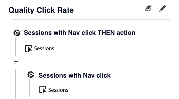
Now, you can show the percentage of clicks that led to something meaningful. That’s the click quality rate.
A navigation entry with 40% click quality means 40% of the users who clicked it went on to do something that mattered. One with 5% means 95% of those clicks went nowhere. Ouch.
Seeing it in a scatter plot
The clearest way I’ve found to surface this in CJA is a scatter plot:
- X-axis: bounce rate
- Y-axis: navigation clicks
- Bubble size: click quality rate
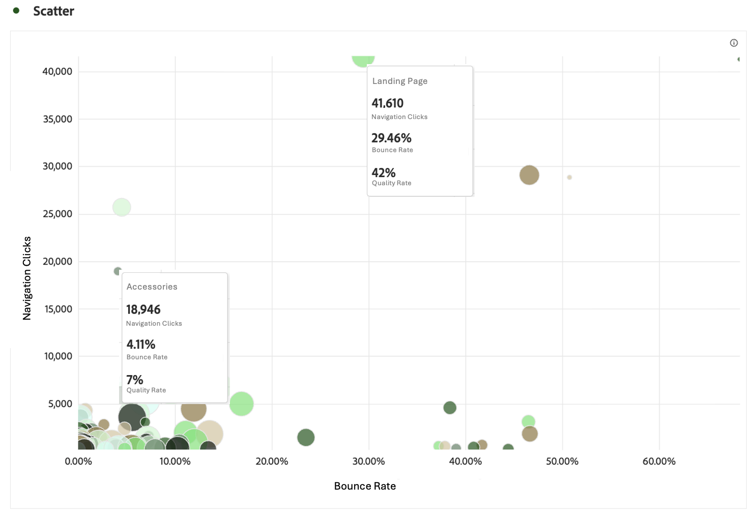
This layout lets me spot an interesting navigation click immediately: high clicks and low bounce rate bubble. That’s would look healthy by every traditional standard. But the bubble size is very small. Telling me that it is quietly failing (“Accessories”).
So I ran this across a large dataset and two navigation entries told the story perfectly. One had high clicks and low bounce, the classic “winner.” But the bubble was embarrassingly small. Most users who clicked it didn’t take a meaningful next step. The other entry had more clicks and a much higher bounce rate. It looked weaker. But the bubble was big. The users who clicked it were far more likely to continue into the funnel.
Optimising for the first entry would have been a mistake I’d have had to explain later.
What this changes
Once I have click quality rate as a dimension, I stop asking “which element gets the most clicks?” and start asking “which element actually moves users forward?” Different questions, different answers, different decisions. And this is just the start. Additional meaningful metrics can be created to help guide the next steps of the analysis.
My point is: bounce tells you where users left. Clicks tell you what they touched. While the click quality rate tells you whether the interaction actually worked. Looking at guiding metrics rather than reporting metrics will fuel the analysis, the conversations and the decicion making.. and I think a quality rate is a good place to start. Now the dialoge is more about the next steps and less about whether the clicks are correct.
What next?
I think an analysis can often end up as someone’s happy memory of a dashboard that looked interesting for a week, but never really changed anything. The real value starts when the analysis creates direction and leads to action. That is the idea of creating these metrics.
A metric like navigation click quality rate is not meant to be perfect. It is meant to guide conversations around where users are actually moving forward in the journey, where they hesitate, and where the navigation is helping versus distracting.
Because in the end, a menu with a high number of clicks is not necessarily successful. A menu that consistently helps users continue toward meaningful actions probably is. Next up for me is to define metrics that tells us more about the journey progression across datasets.
Join the discussion
Leave a comment